Hello, My Creative Compadres!
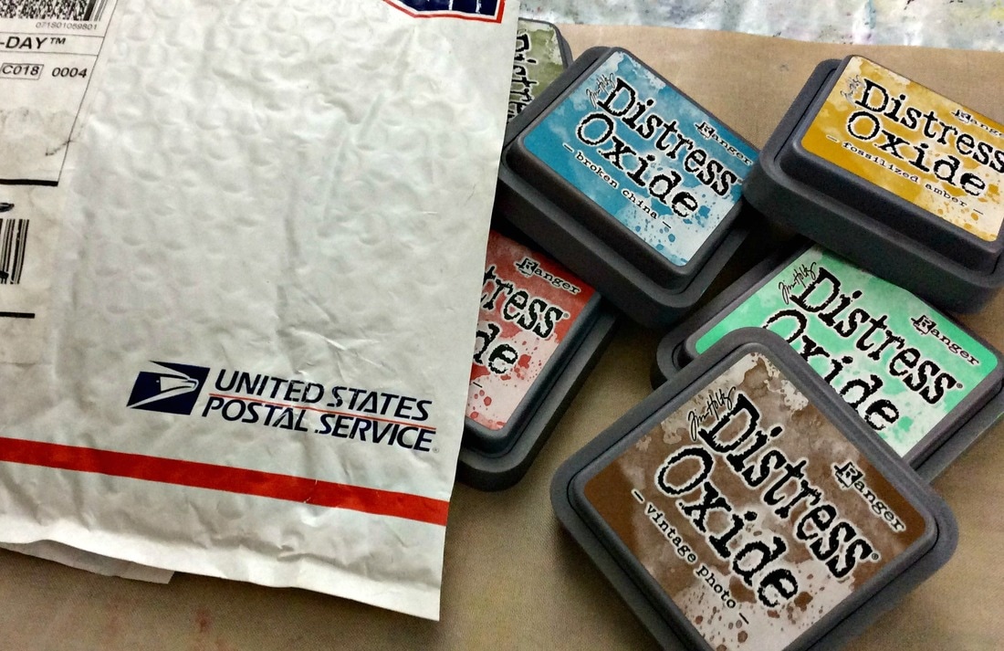
Did I mention that I bought the WHOLE set?.....
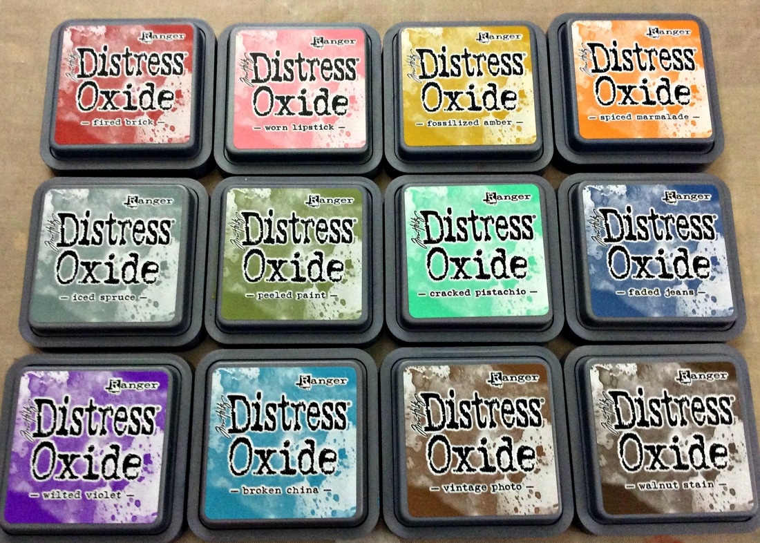
Plus, I bought a few Distress Ink Mini's to go with them!
You may be wondering, what is the difference between the 'old' Distress Inks, and these new Distress Oxides.
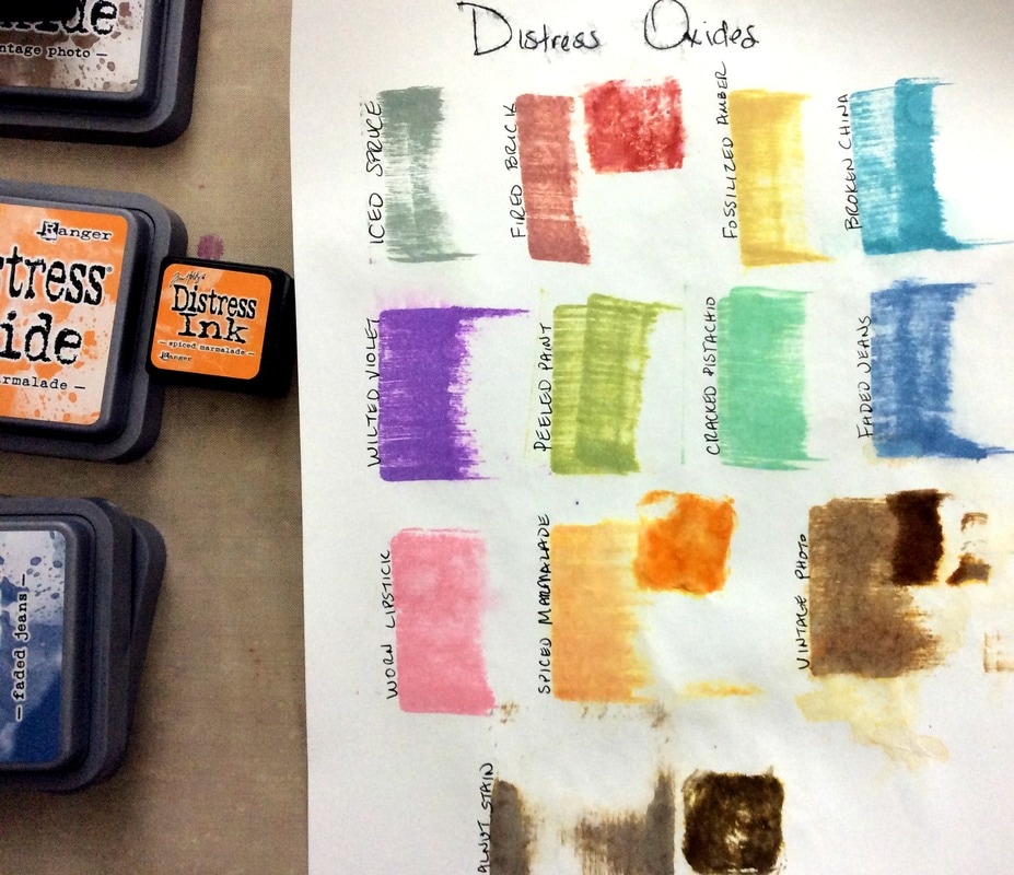
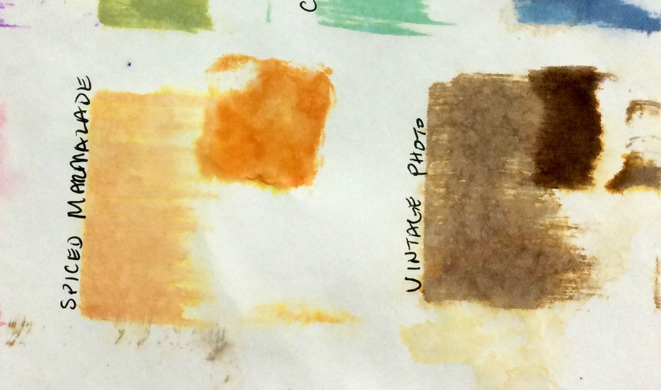
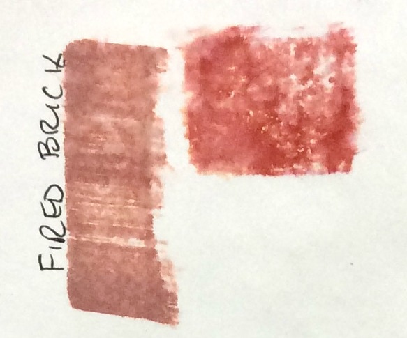
Here's how they are the same: Same type of packaging, case, ink pad. Same color names. You can use them for the same techniques - blending, layering, stamping, etc. What makes them different? The INK!! The actual ink is completely diffent in traditional Distess Ink vs. Distress Oxides. This changes everything! (well, not everything...you know what I mean). Distess Ink is a water-reactive dye-based ink. Distress Oxide is a water-reactive dye-pigment FUSION ink! A whole new category! Awesomeness!! What does that mean for us? It means we now have an ink that acts like Distress Ink, but is opaque! You can't see through it because of the pigment. That means, we can layer like crazy, and we are less likely to get a muddy mess! (an effect I happen to like, and don't consider it "mud" at all....but that 's a topic for another day) It also means that stamping is clearer and crisper. And, the finish appears soft and chalky, once water has been applied. However, it doesn't smudge off of the paper, like actual chalk. It also means that we can still do all of the things we've always done with Distress Inks + more! Pretty cool, right?! So, just to explore a teeny, tiny bit, I decided to swatch out the colors :) I simply swiped the ink pad across the paper, then I spritzed with water to get the oxidized effect. You can see how chalky and soft the colors look.
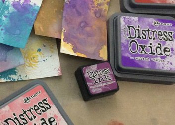
I had a few matching Distress Inks, so I smudged those right next to the Distress Oxides. That made the diffence in intensity and finish really obvious. Distress Inks have a much stronger, deeper color than the Oxides.
Check out my video, Unboxing & Swatching Distress Oxides, if you want to see more :)
I had an awesome time playing and testing out my new Distress Oxide Inks!
I will be sharing more in upcoming blogs, including paper testing and a project...maybe 2.
In the meantime, I thought you might like to check out some other great resources :)
Tim Holtz, the creator/designer of Distress, has an amazing blog, and you might want to check out his CHA demo of these wonderful inks, if you haven't seen it yet. Jennifer McGuire also has a great tutorial and free swatch download over on her blog! If you are a card maker, I highly recommend that you hop over there. :)
Alrighty! I will see you soon with more inky goodness :)
Supplies |
Enjoy
Art + Inspiration in your inbox! Usually 2x monthly, sometimes a bit more :) Join me for
|





 RSS Feed
